Our Brand Identity
Resources and guidelines for the PAYSITE.com brand. We empower creators in the adult industry with professional, high-performance web tools.
Includes SVG, PNG, JPG, and AI
Primary Logos
The core visual representation of PAYSITE.com
Standard White Color
For use on dark backgrounds
Standard Black Color
For light backgrounds and print
Monochrome Black
For light backgrounds and print
Monochrome White
For dark backgrounds and print
The Domain Mark
Logo variations including the .com suffix for explicit URL reference.
Standard White Color
For use on dark backgrounds
Standard Black Color
For light backgrounds and print
Monochrome Black
For light backgrounds and print
Monochrome White
For dark backgrounds and print
Brand Symbol & Icon
Our condensed 'P' mark used for profile pictures, app icons, and browser favicons.
Standard White Color
For use on dark backgrounds
Standard Black Color
For light backgrounds and print
Monochrome Black
For light backgrounds and print
Monochrome White
For dark backgrounds and print
Color Palette
Our signature colors define the energy and authority of our brand.
Paysite Red
#EB0000
Pure White
#FFFFFF
Pure Black
#000000
Logo Principles
Detailed specifications for spacing and partnership lockups.
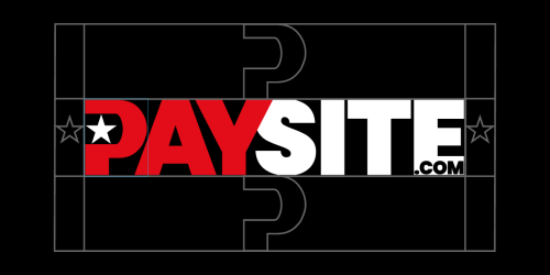
.01Clearspace
To ensure visual impact and legibility, the PAYSITE.com logo must always be surrounded by a minimum amount of empty space. This "Safe Zone" is defined by using the "STAR" for the left and right margins. The top and bottom are spaced using the height of the P. No other visual elements, text, or page borders should infringe upon this space.

.02Co-branding & Partnerships
When the PAYSITE.com logo is used alongside a partner or creator logo, they should be separated by a vertical divider line. Both logos must appear with equal optical weight. The vertical line should be the same height as the "PAYSITE" logotype and set at 20% opacity.
Usage Guidelines
To maintain brand integrity, please follow these simple rules.
The Do's
- Provide ample clear space around the logo.
- Use the red/white version on dark backgrounds.
- Maintain the original aspect ratio at all times.
- Ensure the logo is legible at smaller sizes.
The Don'ts
- Do not stretch, skew, or rotate the logo.
- Do not change the brand colors.
- Do not add drop shadows or glow effects.
- Do not use the logo on busy or low-contrast images.
Ready to use our assets?
Can’t find exactly what you’re looking for? If you have special requirements, need high-resolution print files, or require further assistance with our brand identity, please contact our brand team at info@paysite.com.
Includes SVG, PNG, JPG, and AI